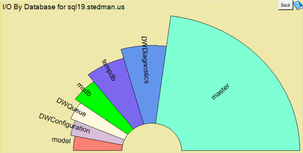
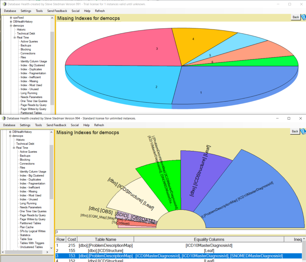
In the Version 994 release of Database Health Monitor this week there are a number of new report formats that I have created and replaced several of the boring pie charts.
Here are a few before and after comparisons between the pie chart and the half-donut charts.
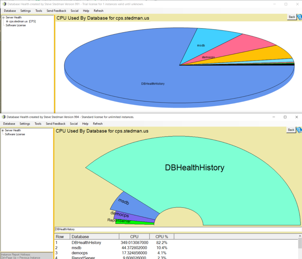
One of the things I like is that on the new half donut charts the text labels are shown better and easier to associate with the chart part. Plus with the new layout I am able to display more labels that I could fit in the past on the pie charts.
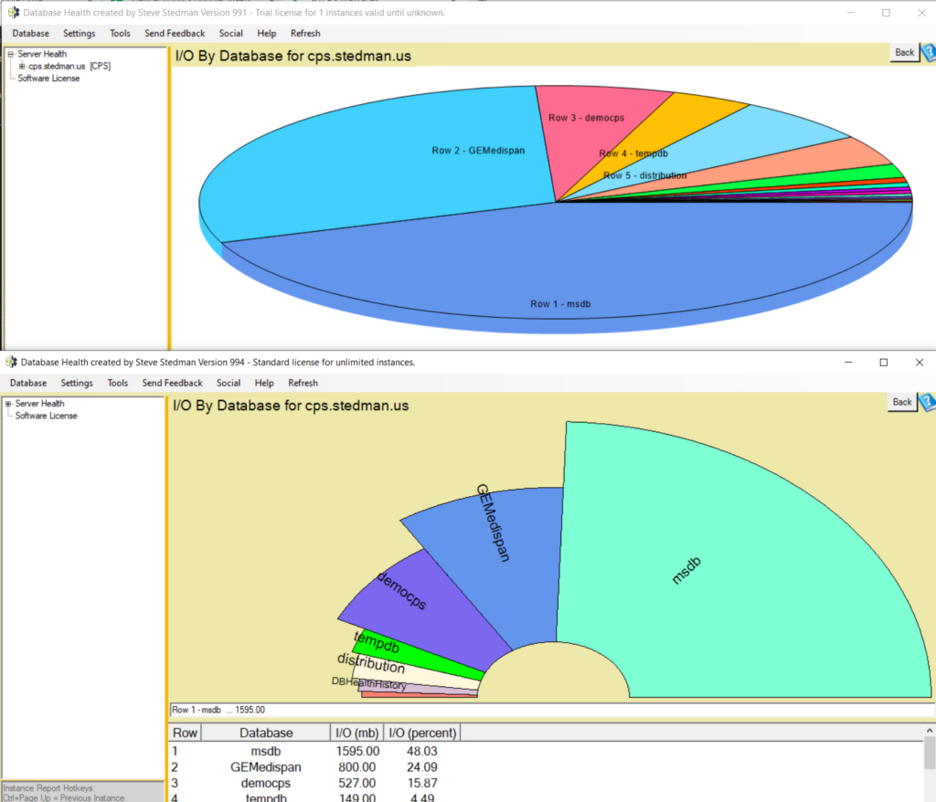
Next with the same amount of screen space we are better able to show the relationships in the sizes. Some percentages shown on the pie chart were a bit of an optical illusion and looked different than they actually were.
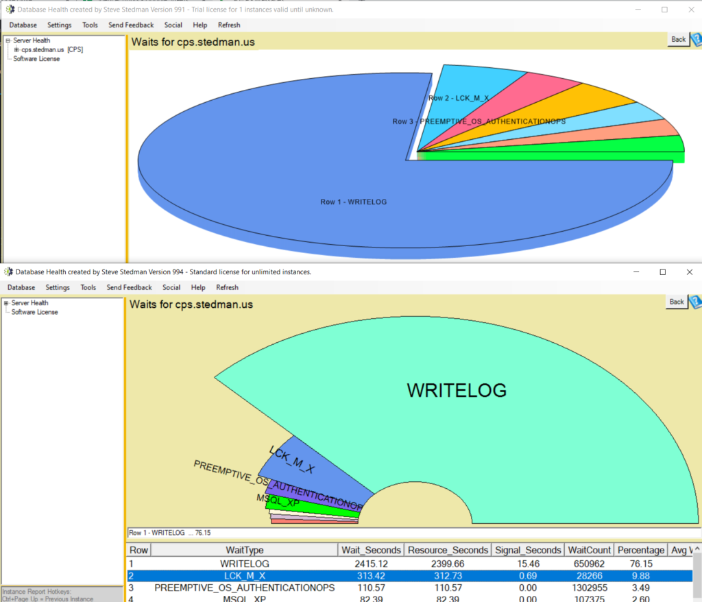
In the past where all we could fit on the chart was a number, now we can display more text.
And finally just like most of the other charts in Database Health Monitor, you can right click and select the “Copy Chart To The Clipboard” option if you want to use the chart somewhere else.
Related Links:
- Database Health Monitor download page. http://databasehealth.com/download2/
- 5 Year Unlimited License. https://stedmansolutions.com/store/dbhm-5-year-unlimited/
- Database Health Monitor class. http://stevestedman.com/dbh-school
More from Stedman Solutions:

Steve and the team at Stedman Solutions are here for all your SQL Server needs.
Contact us today for your free 30 minute consultation..
We are ready to help!