As we have been building the Uzility agile product, we have been following agile development principles, following the release early, release often and get customer feedback.
There have been things that we have tried, and things that we have learned from, and updated or changed. Its interesting when you have a design for part of the system that you think looks good, then the graphics designers and UI/UX team takes a look at it and they provide new designs. It goes to show how valuable it is to have great designers on the team.
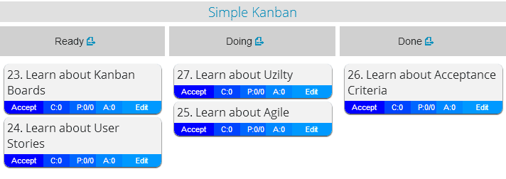
Here is an example, the card design prior to last week:

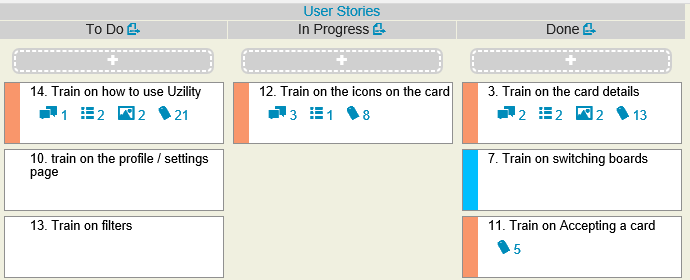
And the new look of cards in the Uzility system based on the designs from our graphics design team:
New Style 1:
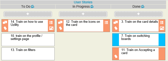
New Style 2:
With both styles, the color of the card represents who the card is assigned to. Each user can choose their own color. Also with both, there are 4 icons that can be shown that represent Comments, Acceptance Criteria, Point Estimates, and File Attachments. If the icon is shown it means that those items have been entered on a card.
For instance, the following card which shown first with style 1, and style 2 has three icons. One that represents that there are 3 comments on this card / user story, the second shows that there is one acceptance criteria, and that the card has been estimated at 8 points.
I hope that everyone agrees that both of these designs are better than the original, but that I am trying to decide on is which one to use as the default. Both styles are available to the Uzility user, but which one should I set as the default for new customers.
New Style 1:

New Style 2:
Please cast your vote by posting a response to this posting, and let me know which style (1 or 2) should be the default.
This is part of what I love about agile so much is getting customer feedback.
thanks!
-Steve Stedman
Founder Uzility
More from Stedman Solutions:

Steve and the team at Stedman Solutions are here for all your SQL Server needs.
Contact us today for your free 30 minute consultation..
We are ready to help!


New Style 1 is much clearer.
Thanks for the feedback. That’s one vote for Style 1 and one vote (from twitter) for Style 2.